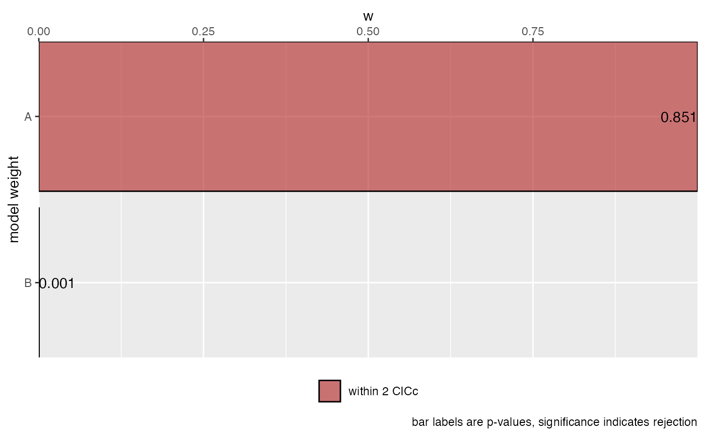
Shows the relative support for each causal model as a bar chart of model weights, ordered from
best to worst. Models within cut_off CICc of the best model are highlighted, since those are
usually considered to have comparable support. Each bar is labelled with the p-value of the
d-separation test, where a significant value means the model is rejected by the data.
Usage
# S3 method for class 'phylopath_summary'
plot(x, cut_off = 2, ...)
Arguments
- x
A
phylopath_summaryobject, obtained by callingsummary()on the result ofphylo_path().- cut_off
The CICc difference within which models are highlighted as having support comparable to the best model.
- ...
Not used.
Examples
  candidates <- define_model_set(
    A = NL ~ BM,
    B = NL ~ LS,
    .common = c(LS ~ BM, DD ~ NL)
  )
  p <- phylo_path(candidates, rhino, rhino_tree)
  plot(summary(p))